Data Visualizations
Dycom’s Data Management leaders approached our UX team with a problem— people were either misunderstanding their reports or completely ignoring them. Once we saw the reports in question, we realized our simple style guide revamp could be an opportunity to tackle a larger organizational issue. For this effort, I collaborated with a researcher and a designer to help our peers deliver more powerful insights across the enterprise. After performing research on existing materials and data visualization processes, we created a tool that would help data analysts choose and create the appropriate data visualizations for a variety of audiences so that business leaders can make the right financial decisions using the insights provided.
Process
User research
My teammates collected research on our users and ended up revealing major gaps in process and content experience. Data analysts were overwhelmed with requests and uncomfortable using their reporting tool (PowerBI). Meanwhile, those on the receiving end of this data found it hard to interpret and inconsistent. After getting a full understanding of the issue, our goal was to not only improve the experience of the final report but the entire creation process.
Solution design
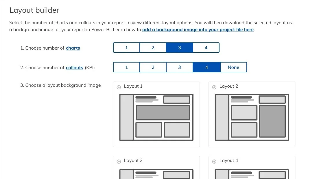
We worked with the Data team to learn about their current reports and processes— ultimately, we felt that whatever final product we create would fit comfortably in Subframe, our design system. Like other components and patterns in the system, we could detail head-to-toe what we expect from data visualizations and even provide tools for them to take into PowerBi (such as templates for reports). We first collaborated on a draft of our standards, where I predominantly provided guidance through editing and overall strategy. I worked with them to cut down overly detailed explanations and create actionable copy to interact with in the final product (see what I mean in the image below).
Outcomes
What we got out of this was a brand new design pattern in Subframe! It lays out some use cases for major charts and tables seen in Dycom reports, as well as provides templates that align with our standards for quick use. Analysts can click through to help them decide what data will best tell their story— we even provided support along the way for implementing these standards while using PowerBI. You can view some screenshots from the site below or walkthrough our prototype of the design.


